Fysiken
Visual identity, logo system, brand language, signage, campaign material and digital applications
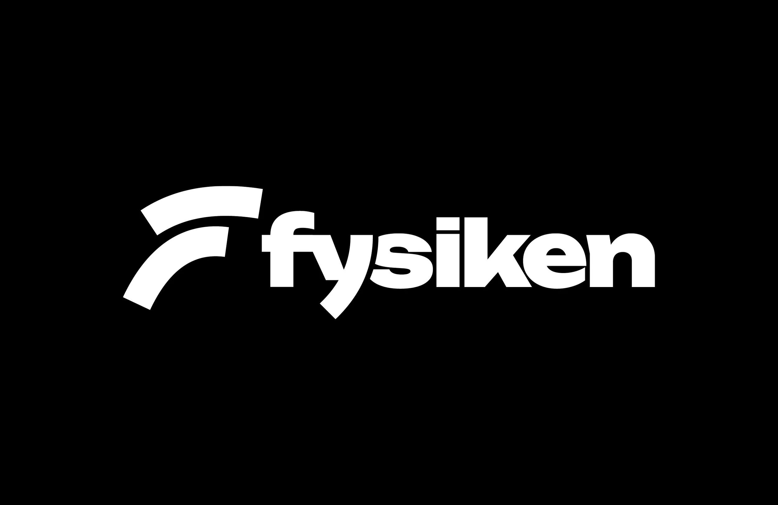
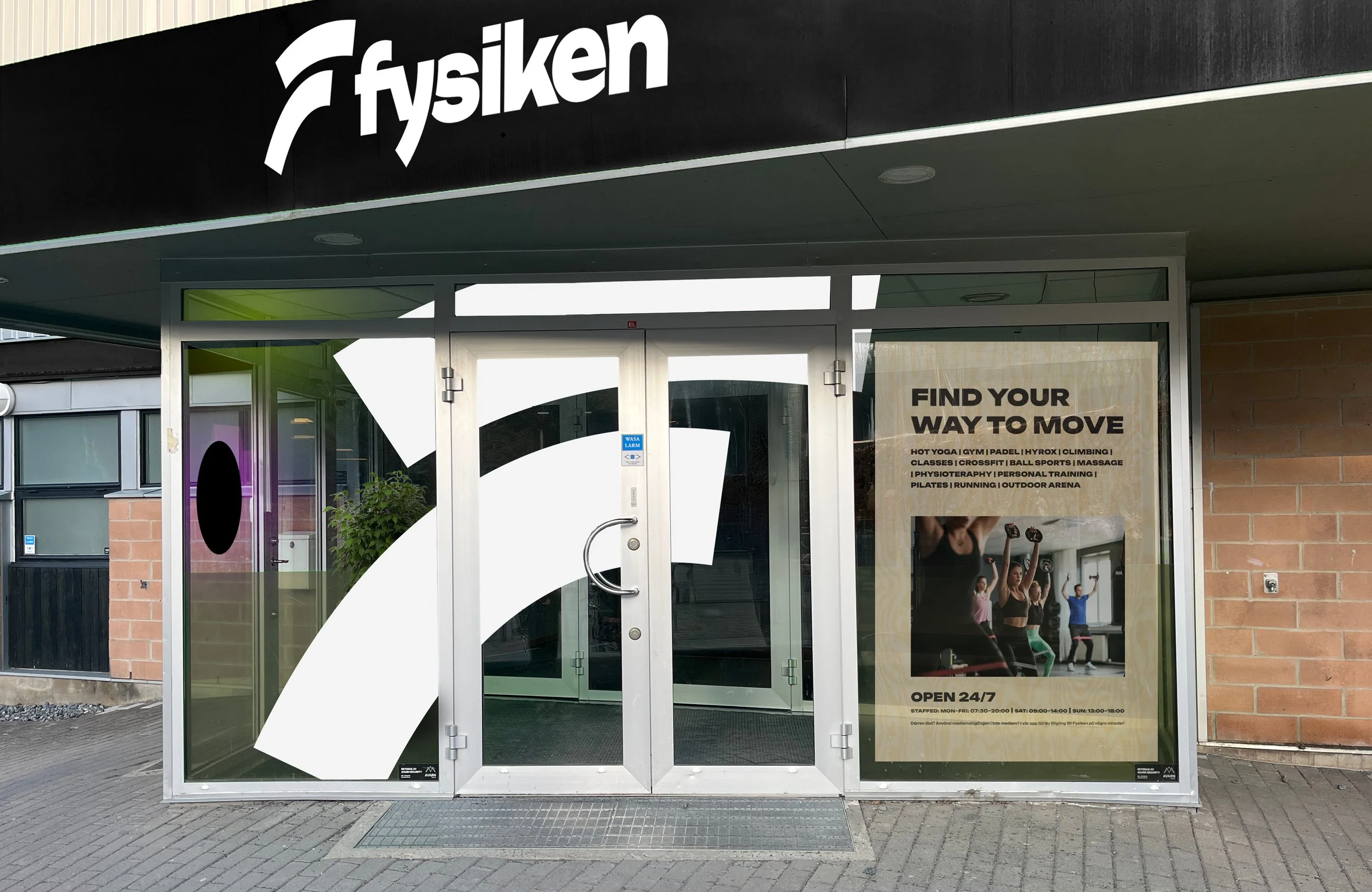
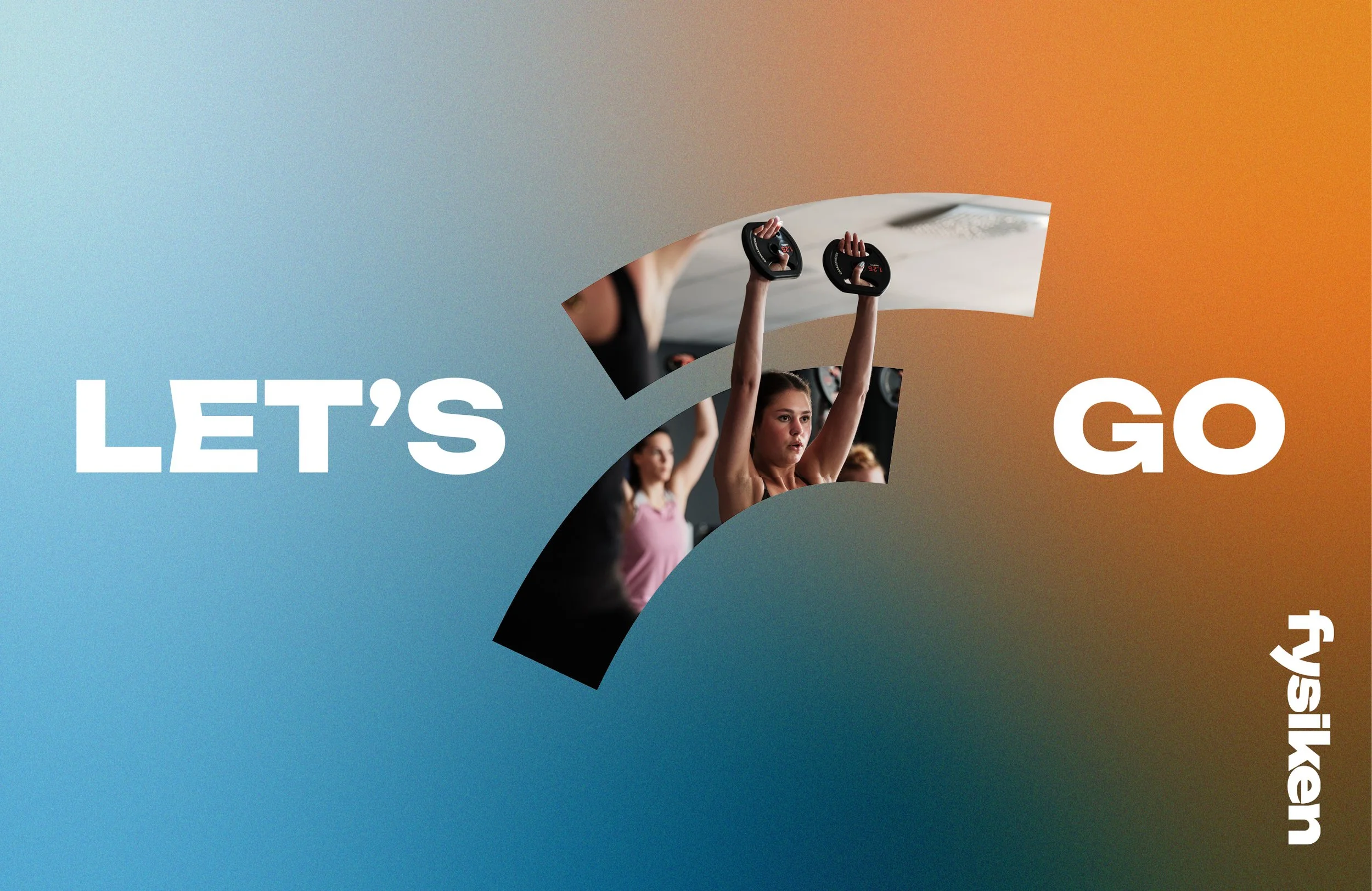
Fysiken is a gym chain with a strong community around movement, training and wellbeing. The existing identity had started to feel dated and needed a clearer, more energetic expression — one that could work across everything from large-scale signage and campaign material to small digital formats.
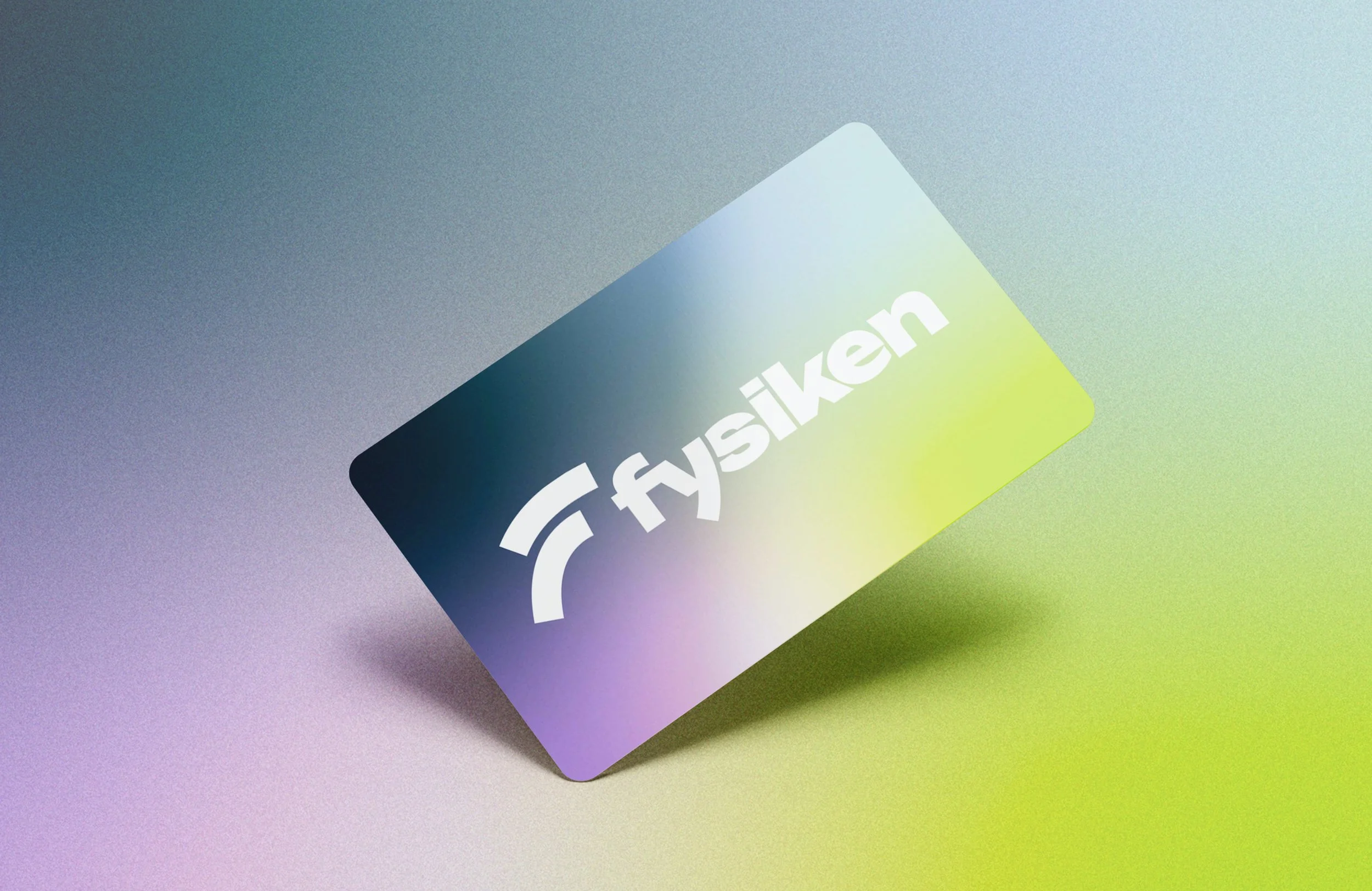
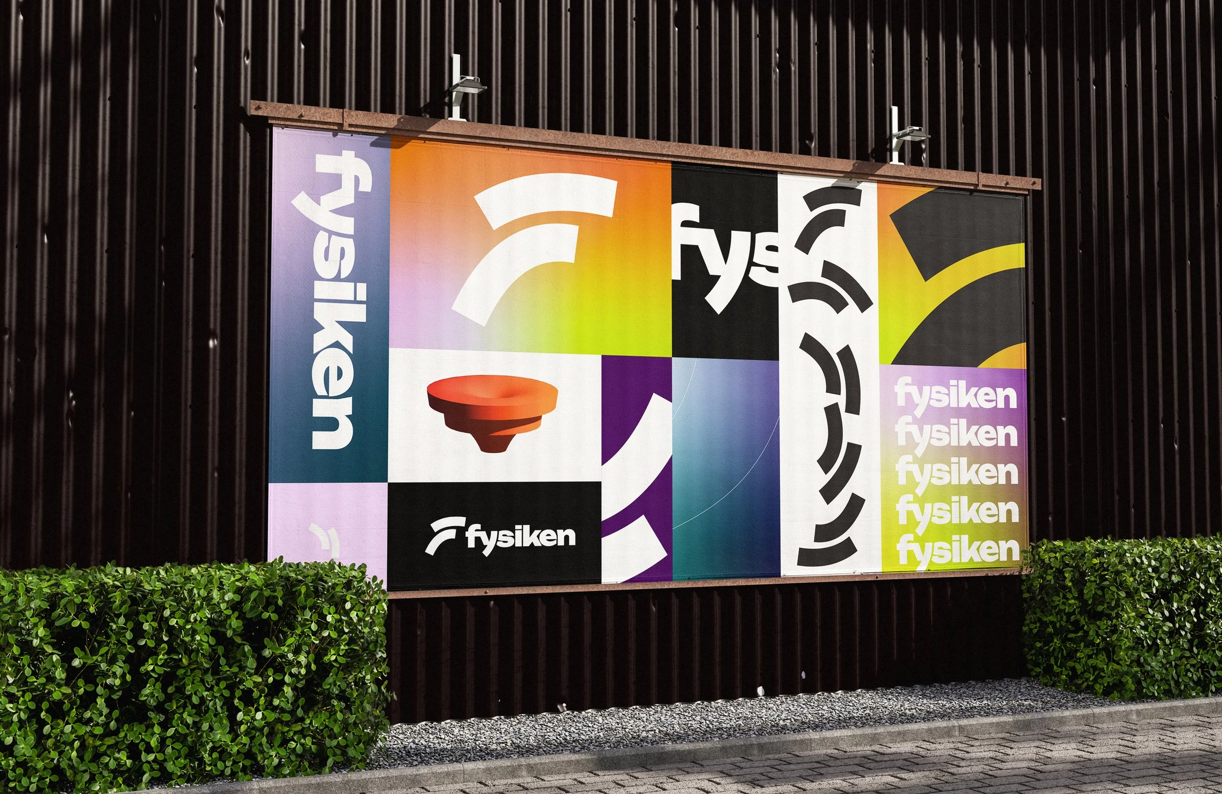
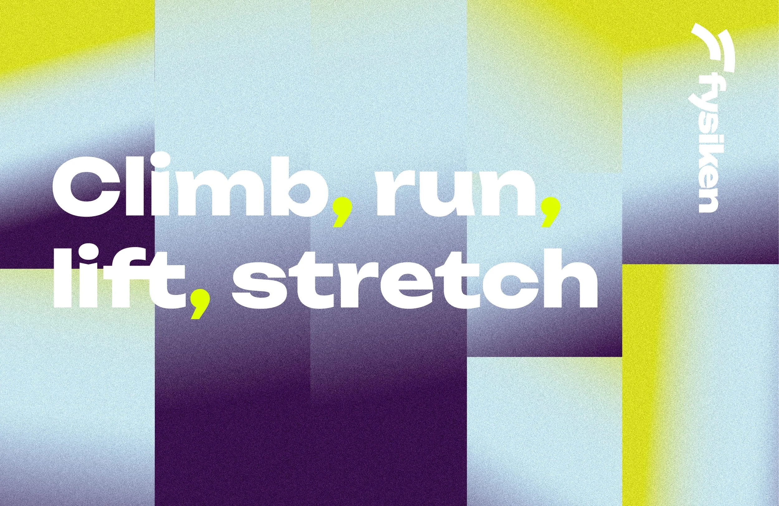
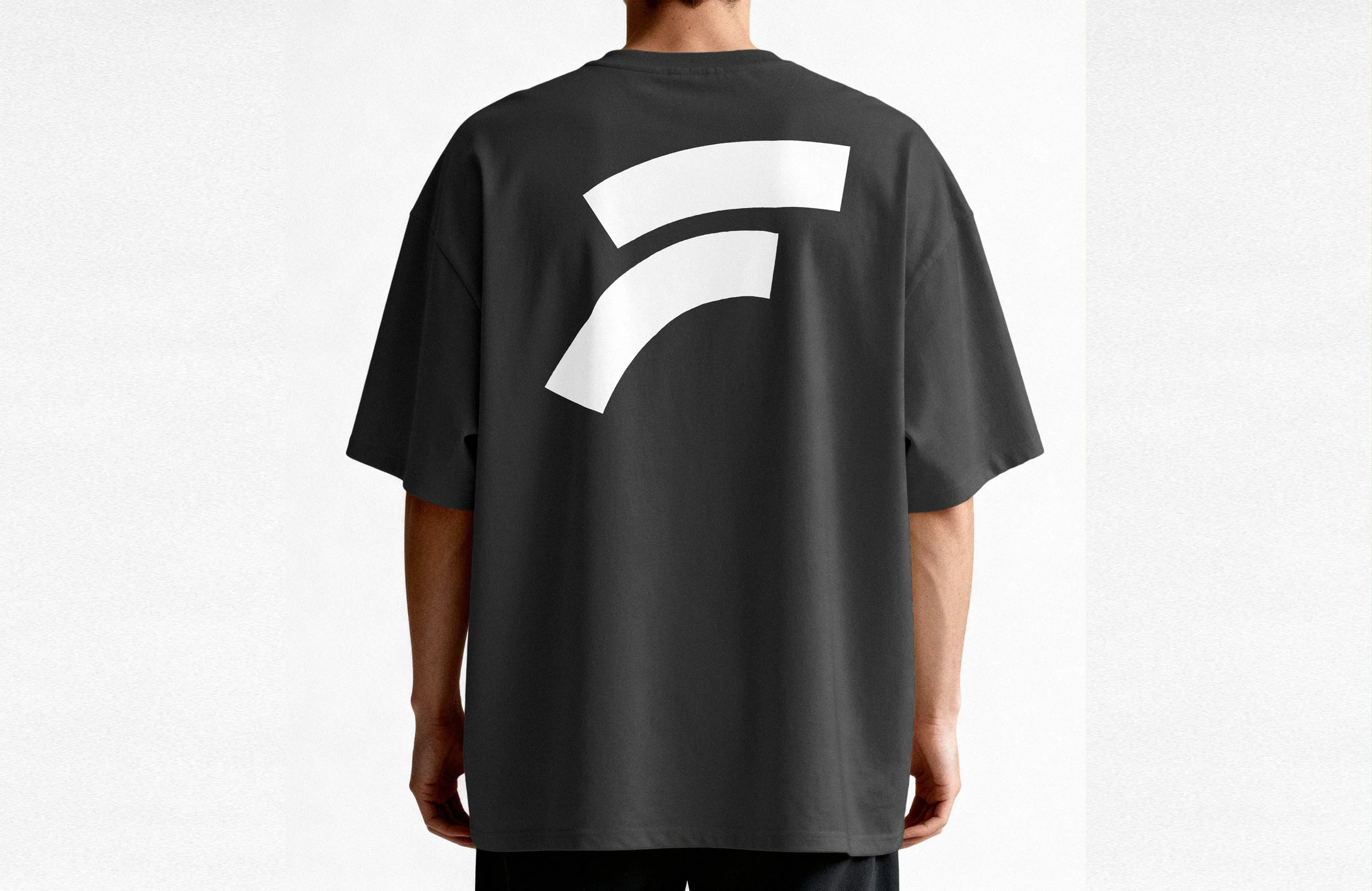
The new symbol is a semi-abstract F built from two moving strokes. Together, they suggest motion, forward energy and circular movement — a reference to training as something shared, and to Fysiken as a community in motion. The visual language combines a bold wordmark with expressive typography and a dynamic colour palette used mainly through gradients, creating an identity that feels active, inclusive and contemporary.
I led the work on the logo and graphic language in close collaboration with my colleague, who led the colour palette, typography and website direction. Together we developed applications for print, digital campaigns, signage, entrances, social media and merchandise. As Fysiken’s in-house creative team, we continue to develop the identity across new formats and campaigns.
Akva
Name, visual identity, logo, graphic profile, signage and printed material
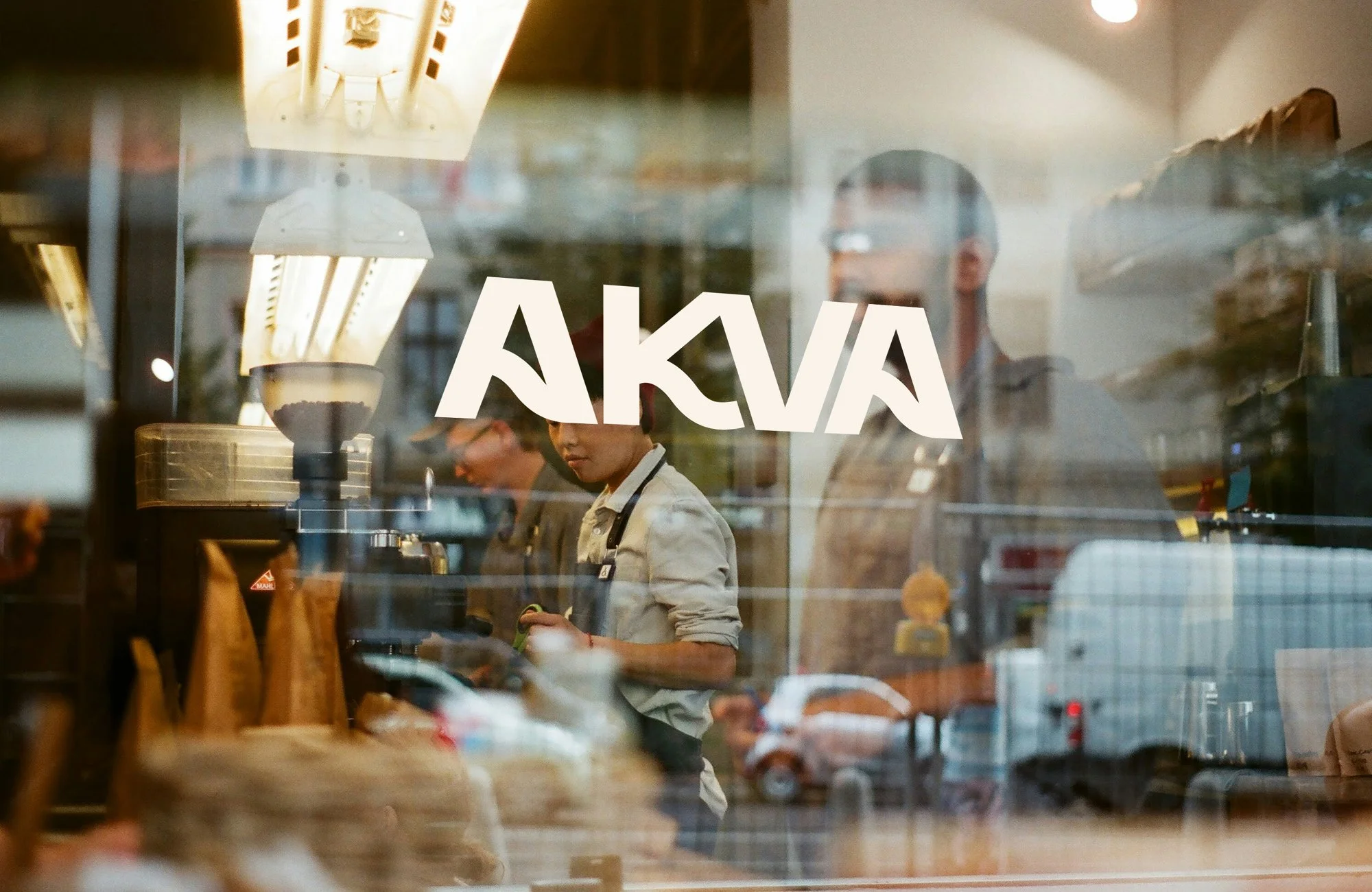
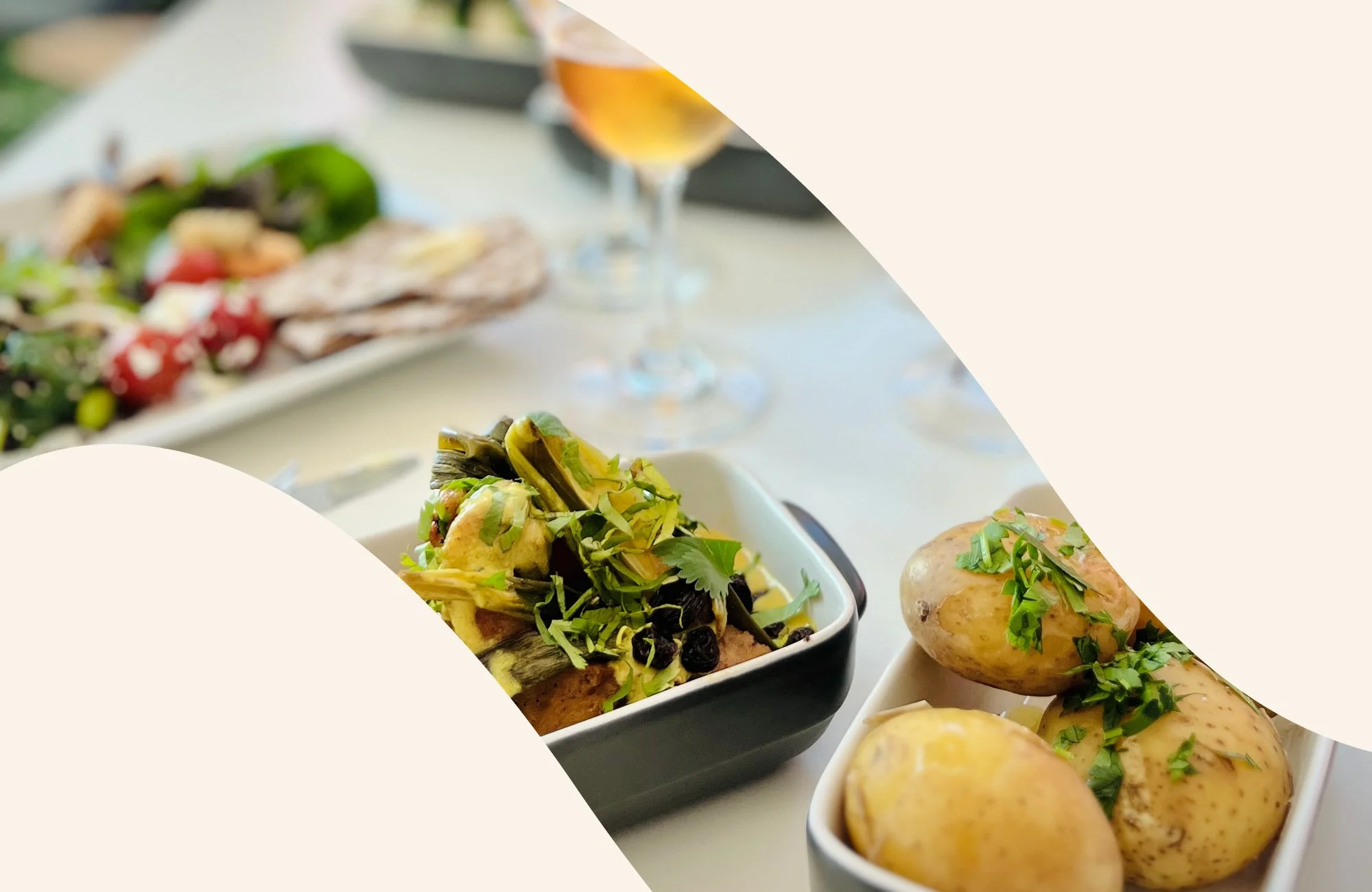
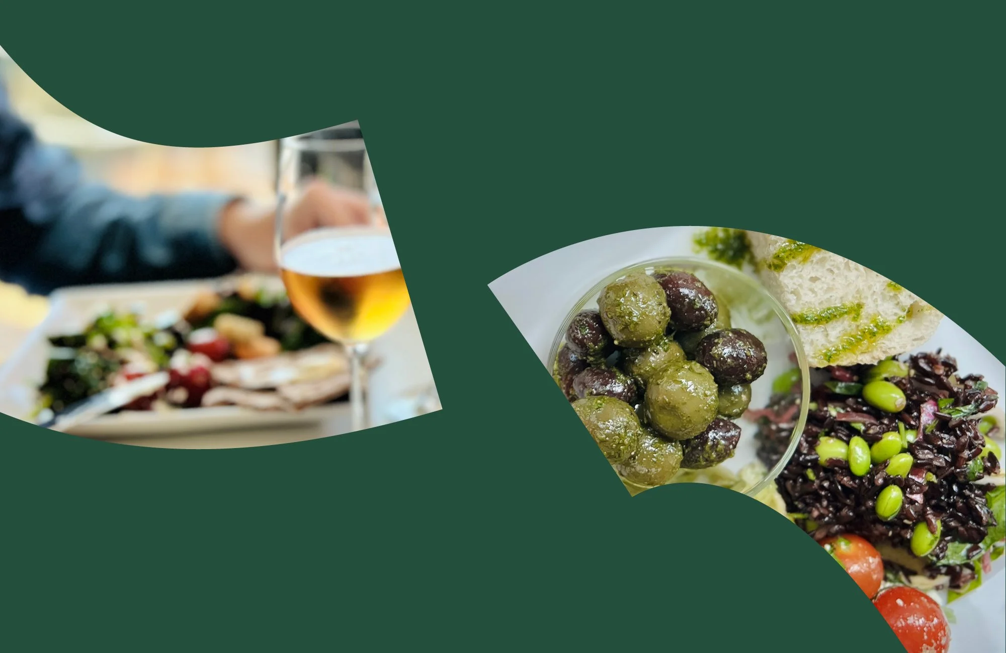
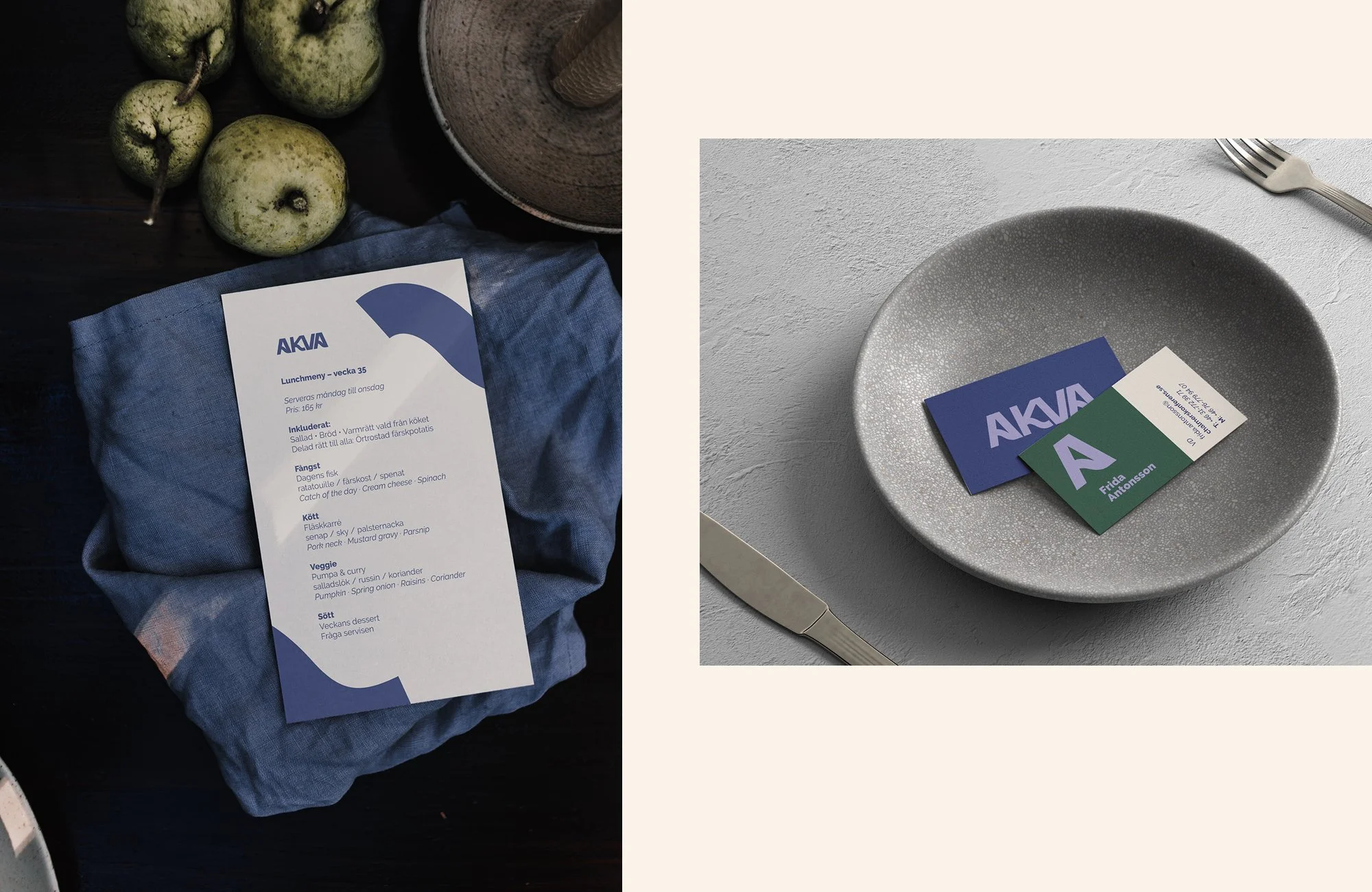
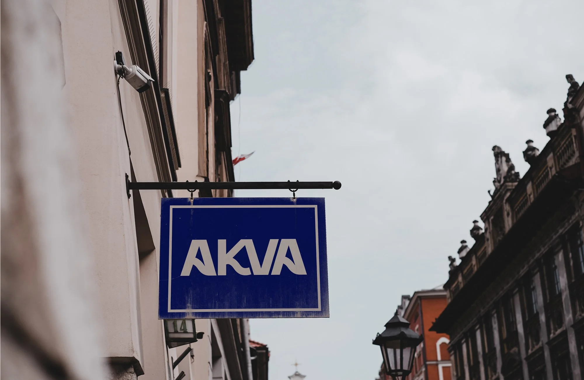
Akva is a waterfront lunch restaurant created as a more refined place for well-prepared food, meetings and everyday occasions with a little extra care. The restaurant needed a complete identity — from name and logo to colours, typography and applications — to support a new direction and a more contemporary expression.
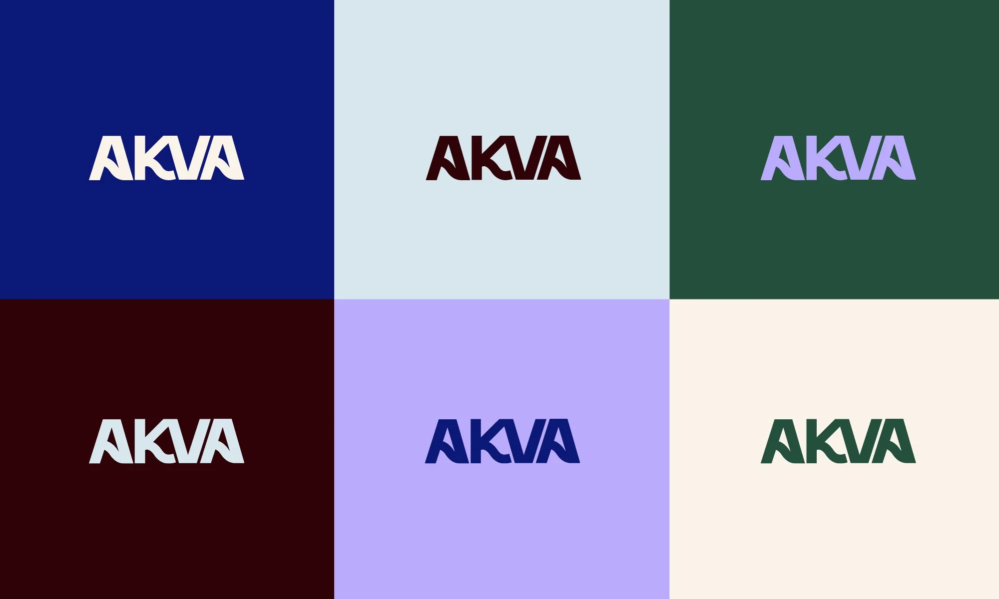
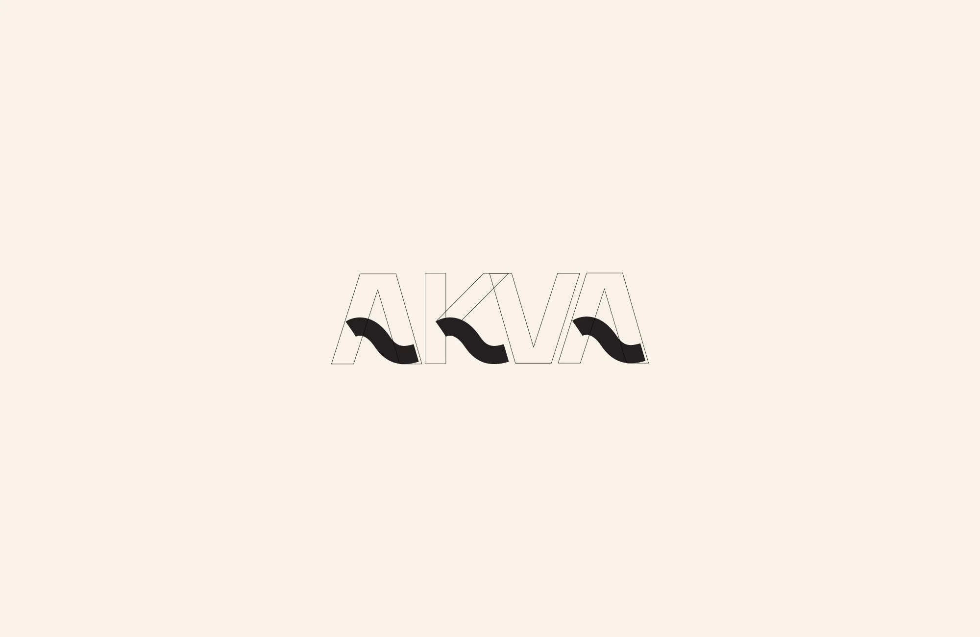
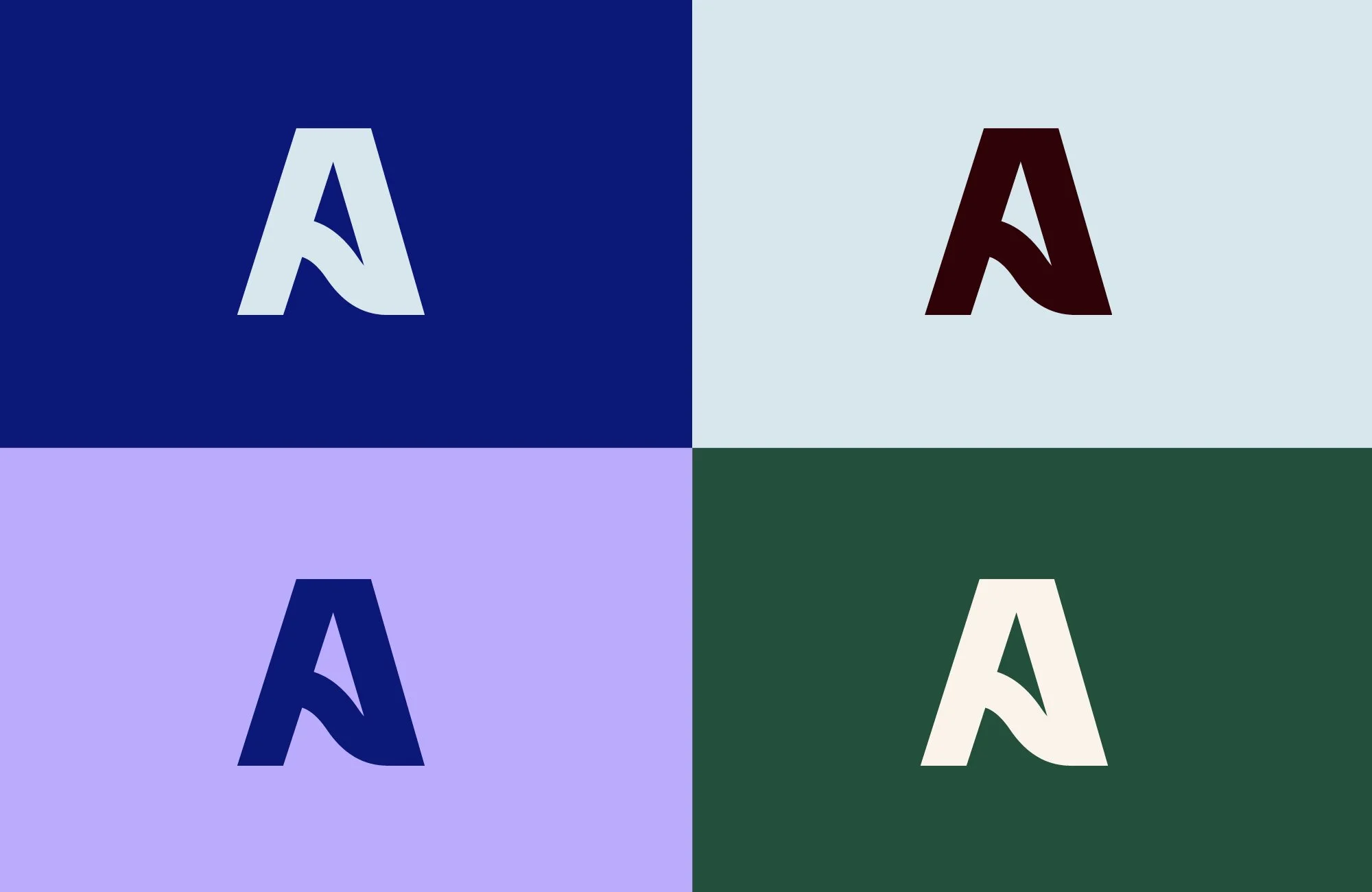
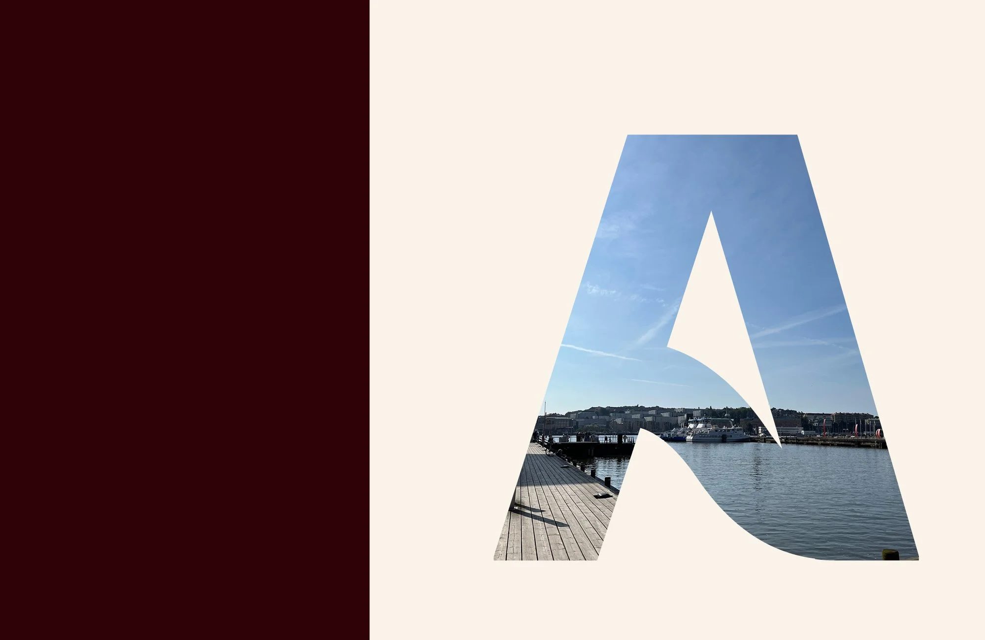
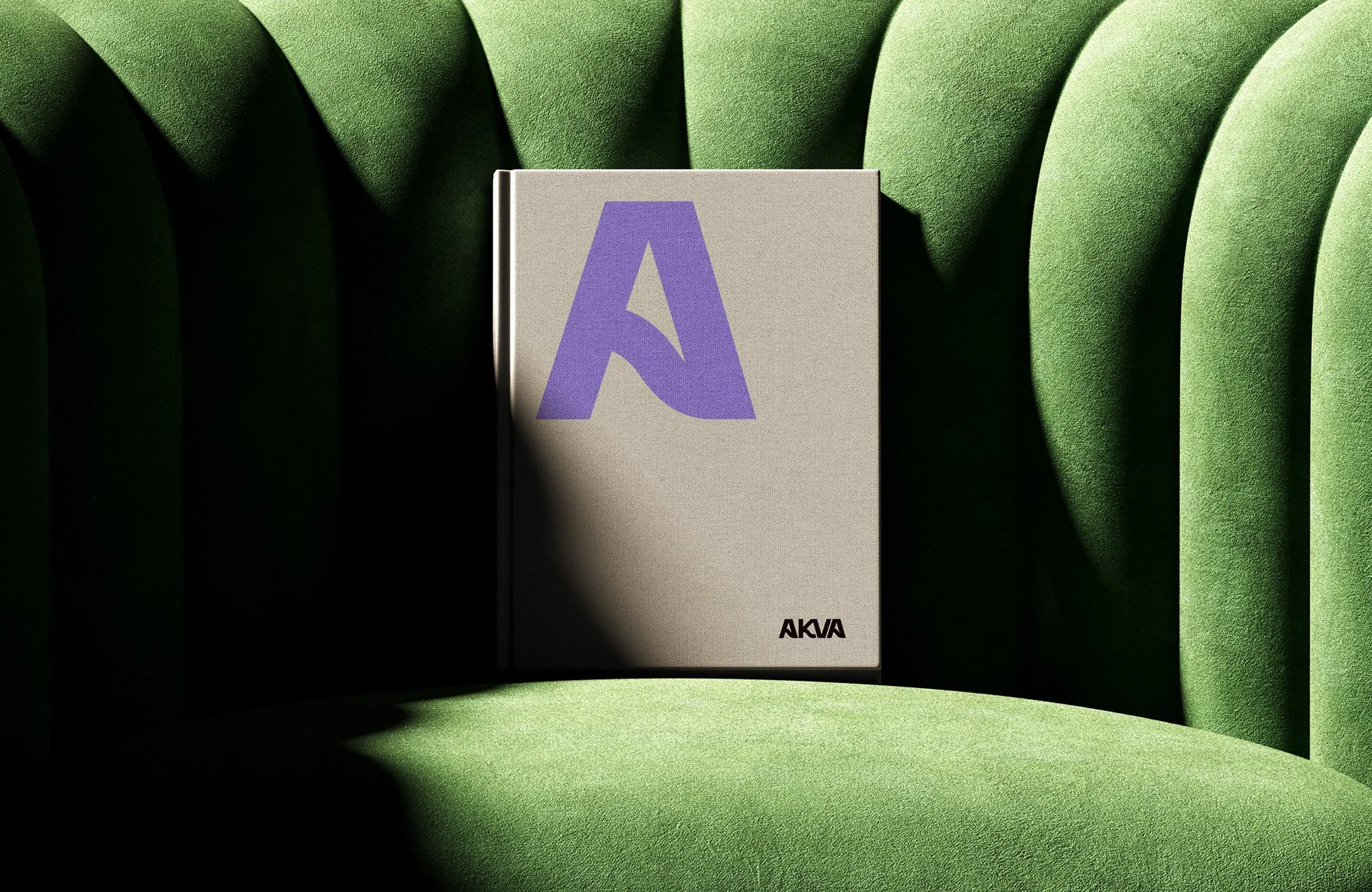
The name Akva draws on water: from the Latin aqua and the Swedish prefix found in words such as akvarium, akvarelland akvavit. The short name became the starting point for a custom wordmark, where wave-like movements run through the letters. The A was designed with a distinct character so it could also work on its own as a symbol.
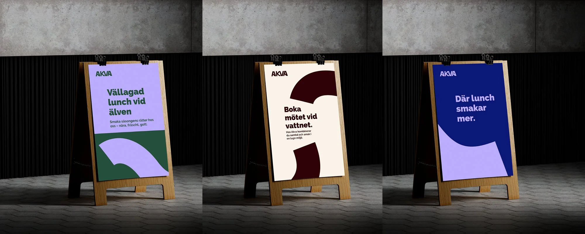
The colour palette is inspired by the water outside the restaurant — shifting between deep, muted tones and lighter reflections from the sea surface. Together with clean typography and a pared-back visual language, the identity creates a balance between calm, quality and personality.
I facilitated workshops with the client and colleagues before leading the design process. I created the logo, symbol, colour palette and typography direction with feedback and sparring from the team. The work included signage, menus, printed material, opening invitations, membership cards, outdoor communication, digital screens and social media material.
Chalmers Studentkår Rekrytering
Visual identity, logo, graphic profile, patterns and brand applications
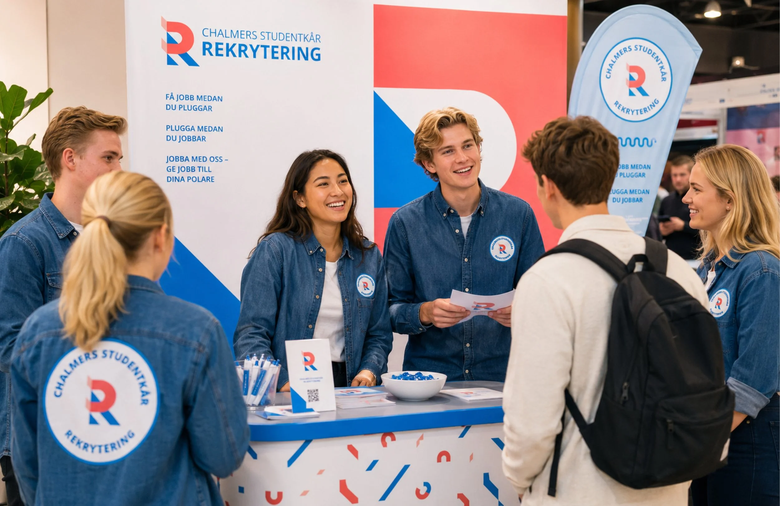
Chalmers Studentkår Rekrytering is a student-driven recruitment company connected to Chalmers Student Union. The company helps students find work experience and helps employers connect with future talent.
The existing identity was closely associated with the student union and needed a clearer personality of its own. The challenge was to create a brand that felt young, approachable and playful, while still professional enough to speak to companies and employers.
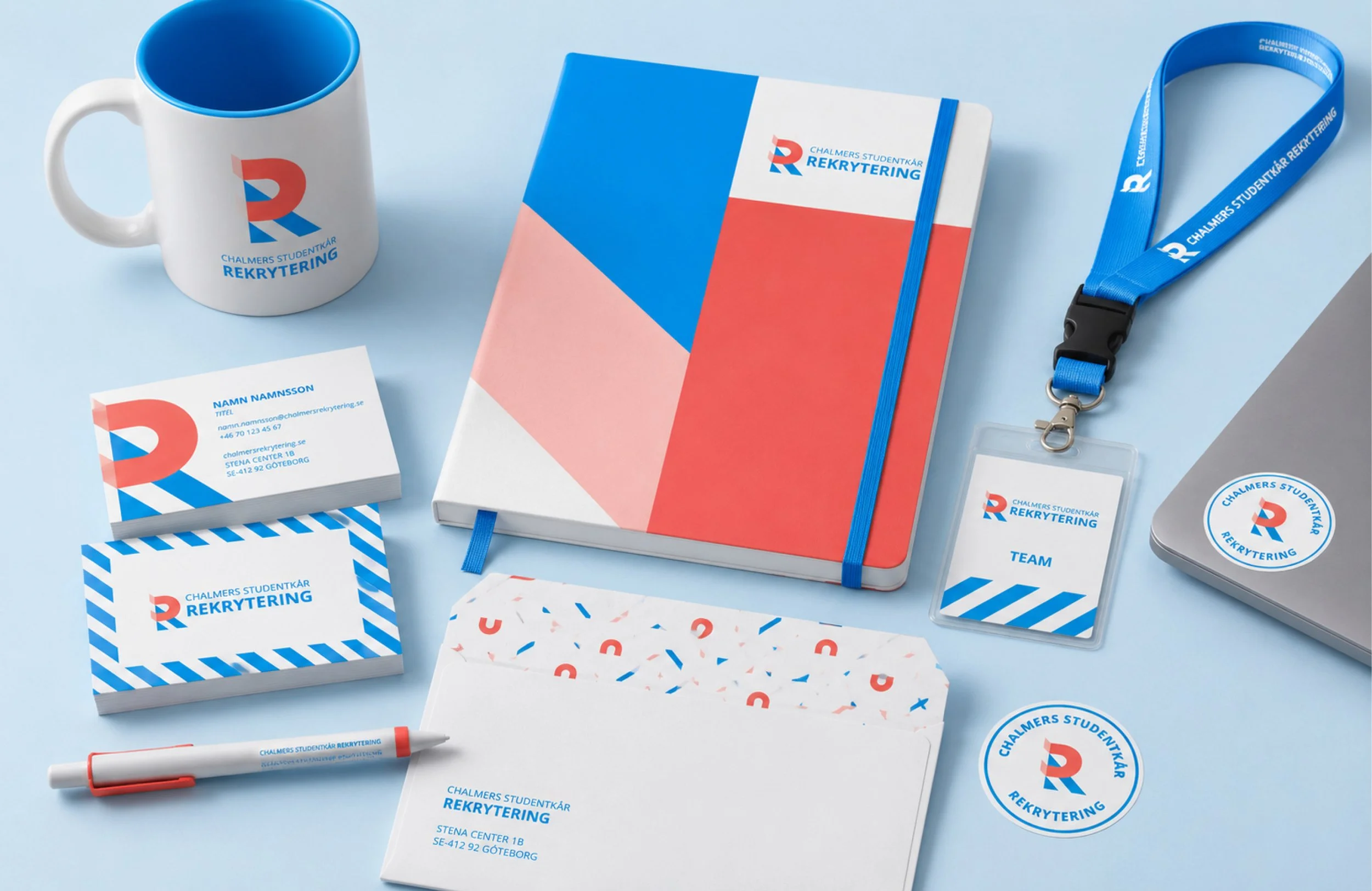
The logo is built around a simple R-shaped symbol made from a magnet and two angled stripes. The magnet represents attraction — bringing the right people and opportunities together — while the stripes connect the identity back to the visual language of Chalmers Student Union. By leaving parts of the form implied rather than fully drawn, the symbol becomes more dynamic and less expected.
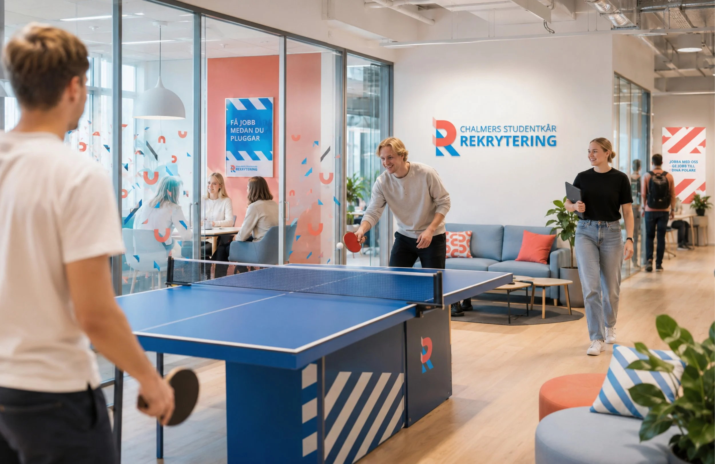
Together with a colleague, I facilitated workshops with the company and its board. I developed the logo, colour palette, typography and graphic elements, followed by patterns, profile clothing, branded products, outdoor material and event applications.
Creation of logo and graphic profile.
The company enables future potential employers to be visible to Chalmers students. Conversely, it showcases the job market's offerings to Chalmers students.
Chalmers student union promotion describes their involvement with students throughout their journey from start to finish, showcasing opportunities. Their new logo symbolizes this path.
The logo's design is based on a circle, which is also used as a graphic element, both whole and divided. With new colors, the brand offers great possibilities, such as ways to work with their theme weeks.
The company also hosts a job fair named Trainee Day Chalmers, which has also received a new logo that matches its parent brand.
Creation of logo and graphic profile.
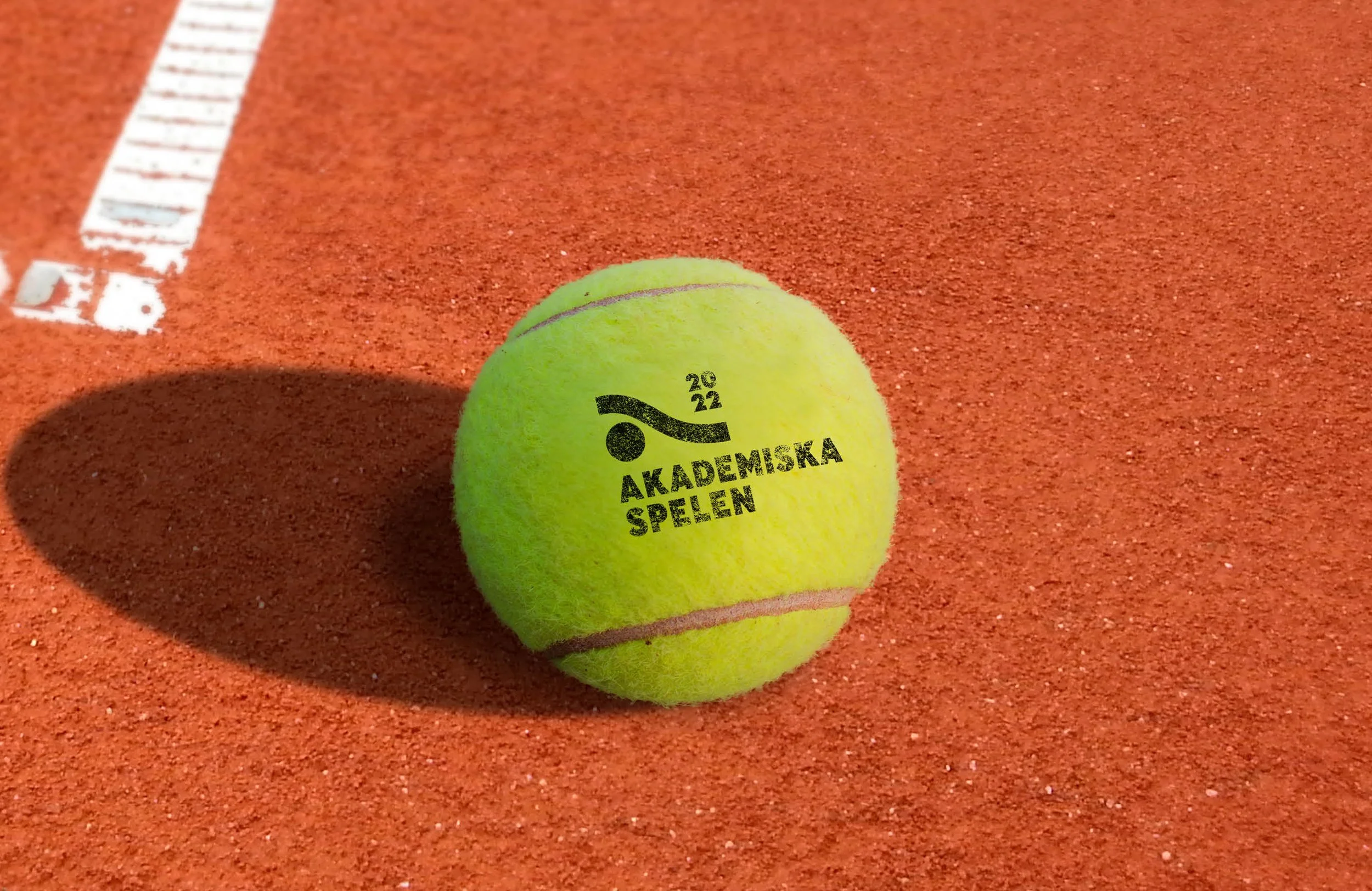
An annual event where students from various universities compete in different sports.
The logo's abstract design evokes associations with various sports while conveying movement and energy.
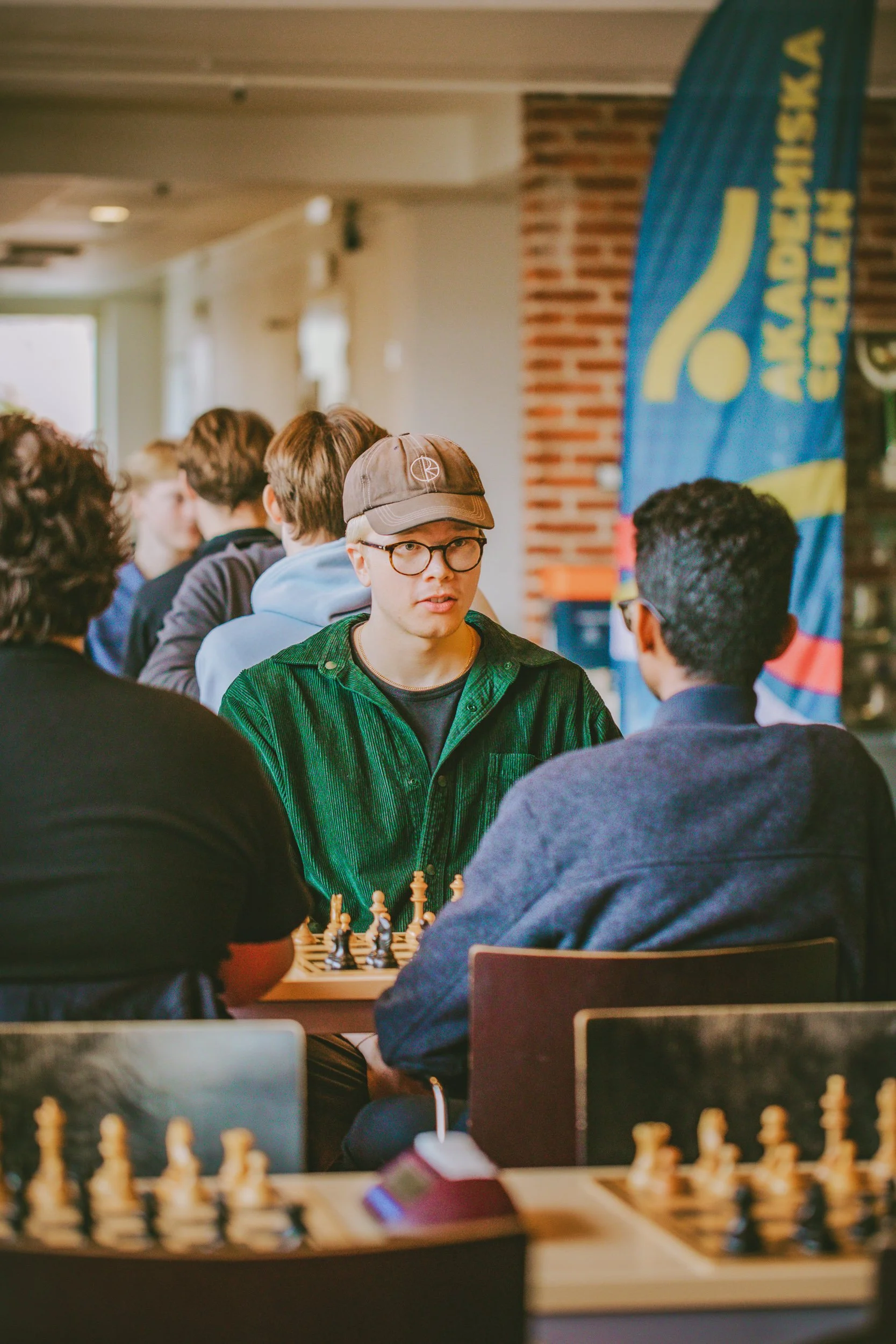
Photos from the event: CFFC
Creation of logo and graphic profile.
Chalmers Technology Consultants (Chalmers Teknologkonsulter) offer specialized consulting services to the business and public sectors, focusing on IT, business development, and technology.
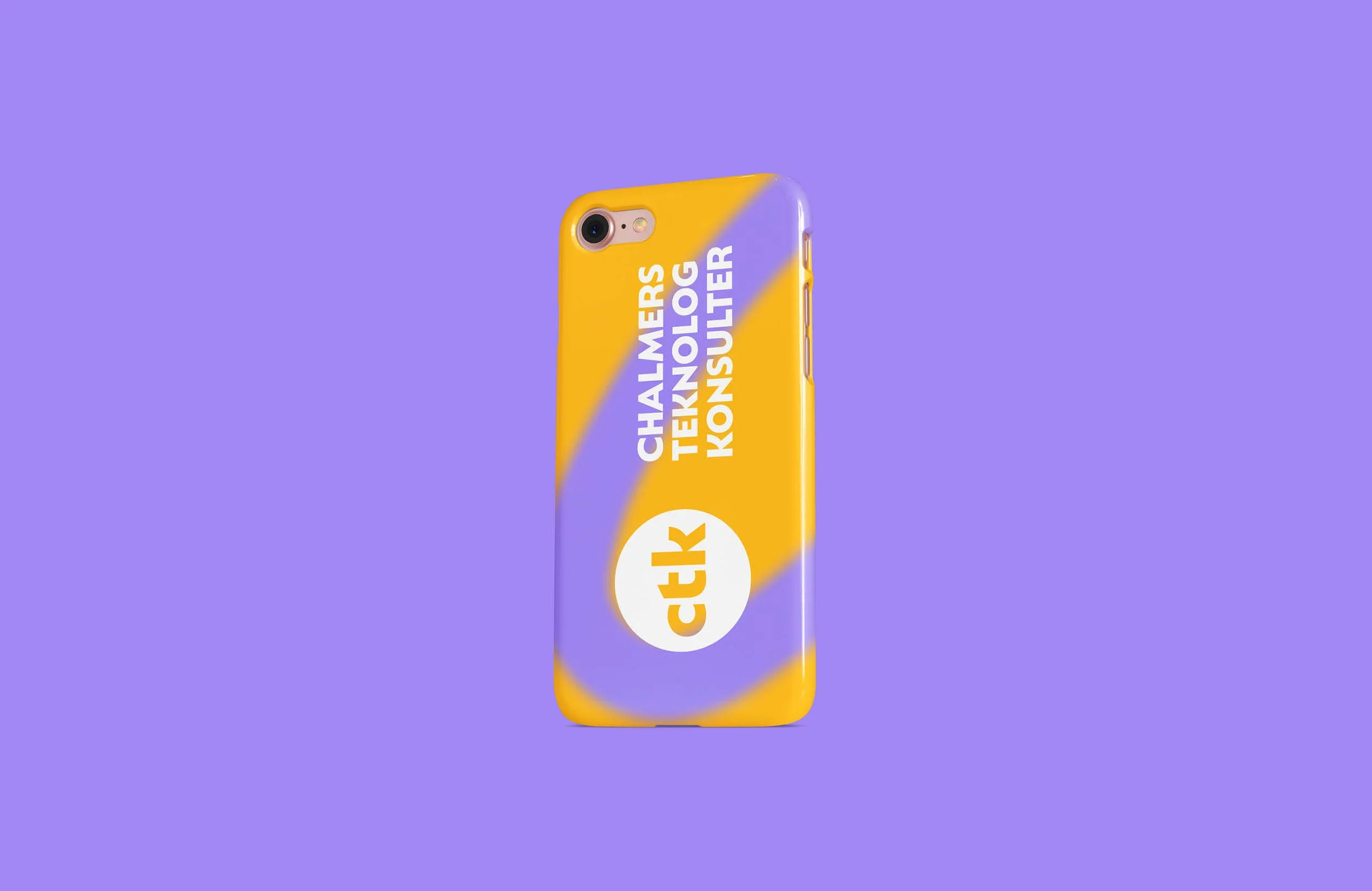
Over the years, they have established a strong brand recognition with their abbreviation and yellow circle. These elements were retained in their brand update. The typography was updated both in style and for readability.
The company has developed a new profile that captures their young consultants while maintaining a professional look. Complementary colors in purple have been added to create visual interest.
Creation of logo and graphic profile.
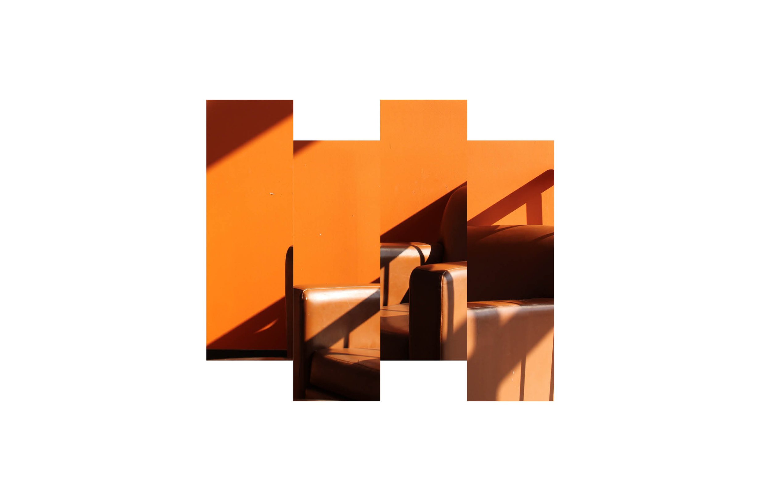
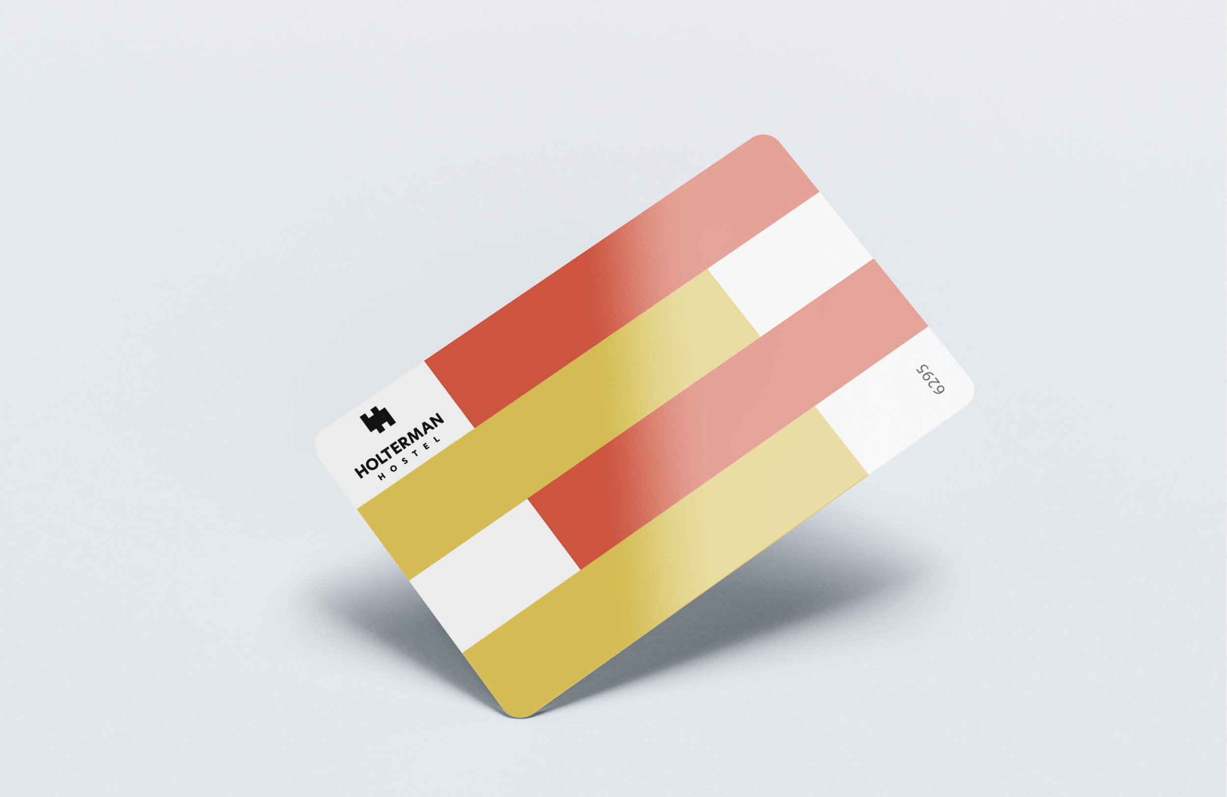
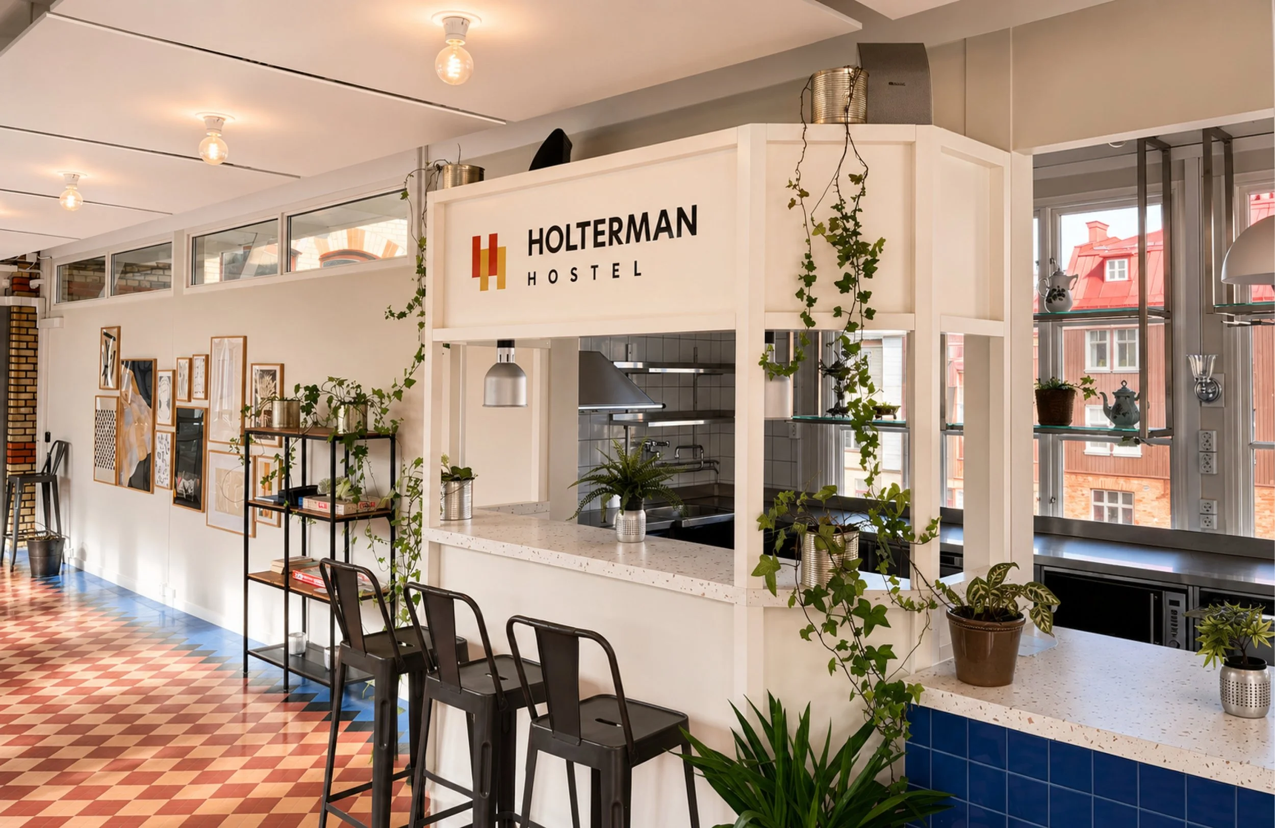
A hostel linked to the future and innovation through Chalmers, while the premises carry the history of the Holtermanska hospital from 1894.
The letters HH are intertwined, mirroring the mortar in the facade. The modern and traditional meet in the typography with its centered sans serif.
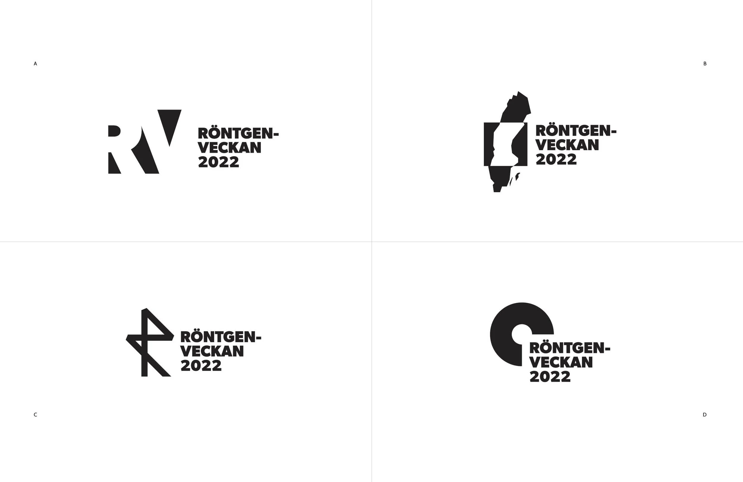
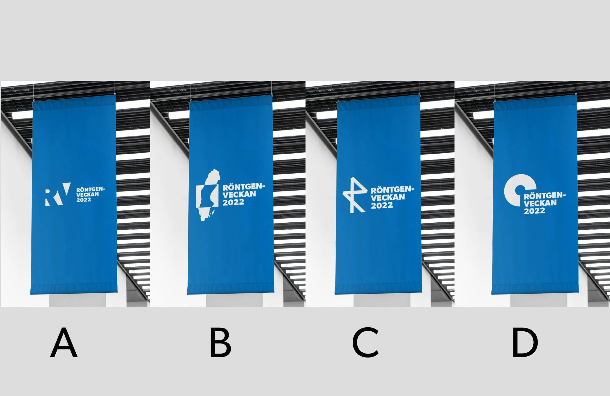
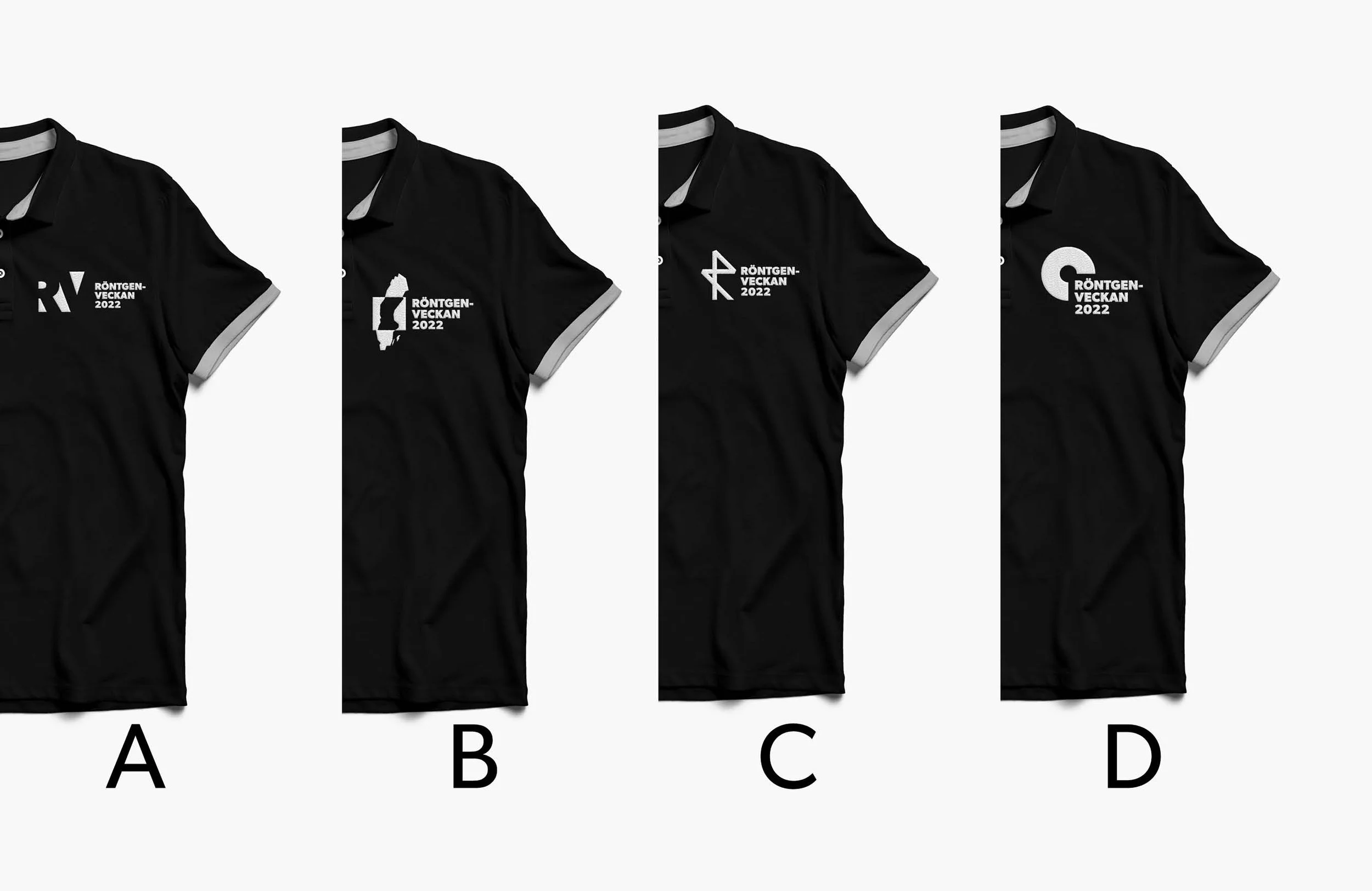
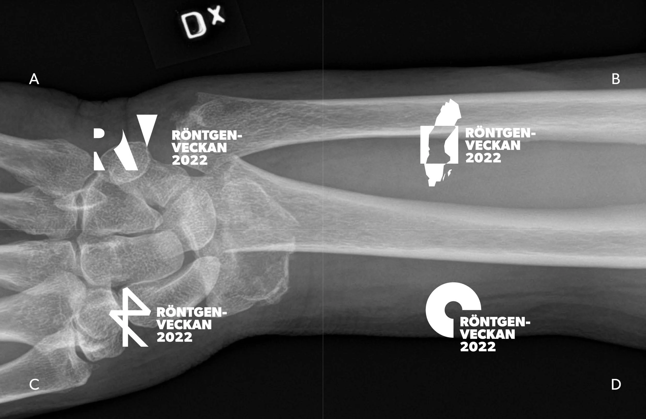
Creation of four logos.
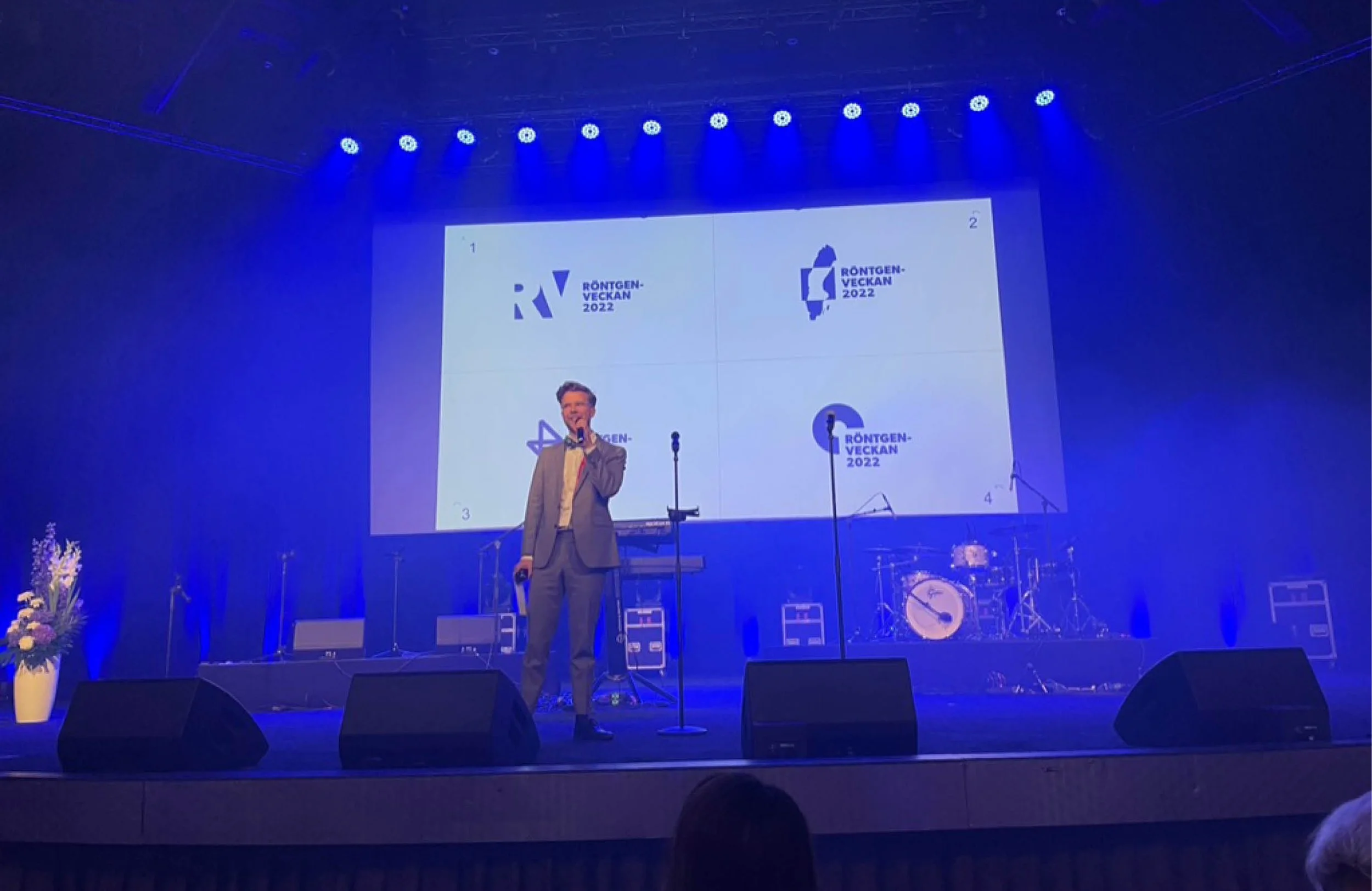
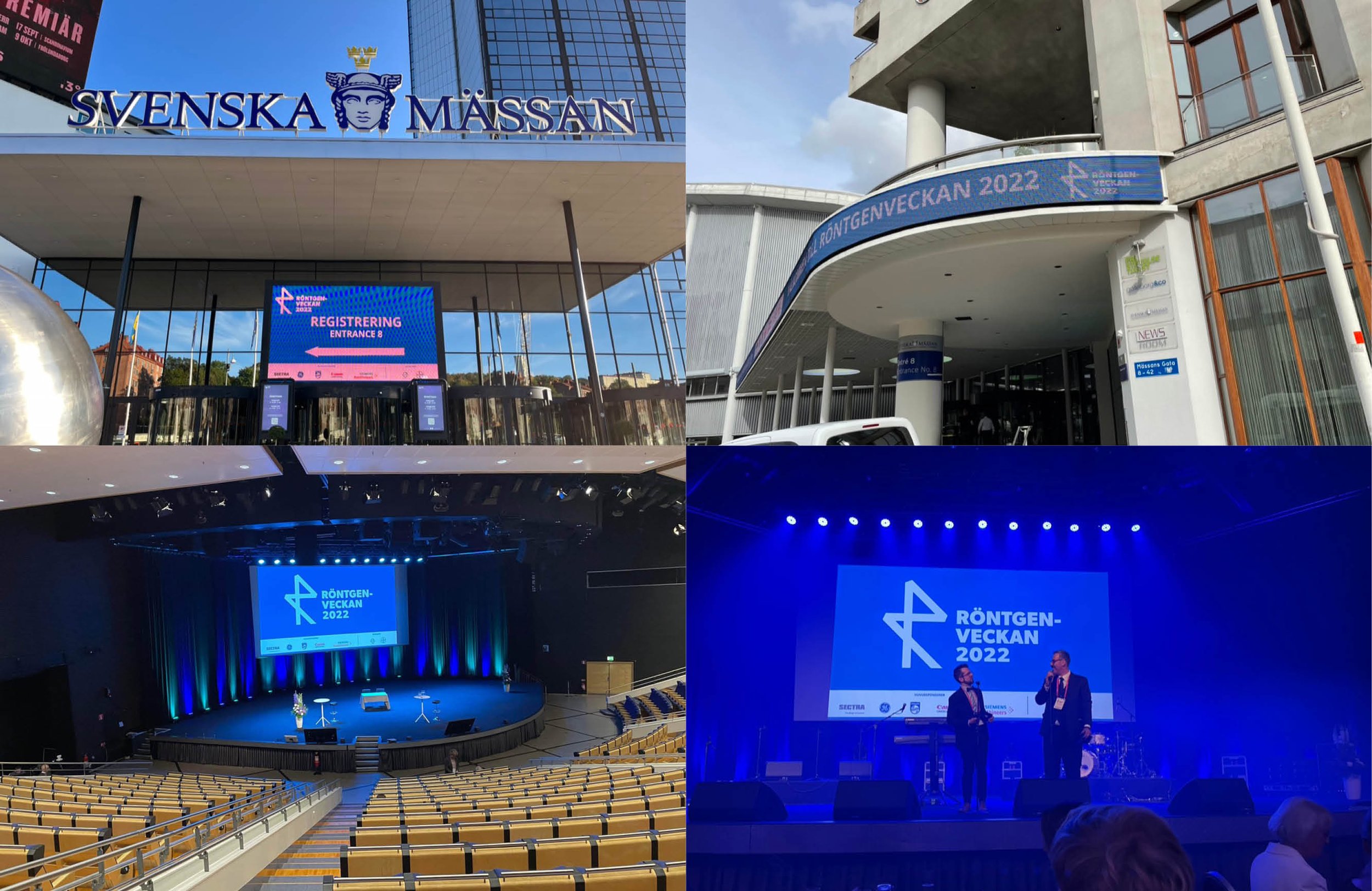
Once a year, people from all over Sweden gather to discuss radiology. It's an important industry event, and to involve the industry despite different organizers each year, all participants voted on a logo from four options.